sleep <- read.csv("https://raw.githubusercontent.com/jsgosnell/CUNY-BioStats/master/datasets/sleep.csv", stringsAsFactors = T)
#need to use stringsAsFactors to make characters read in as factorsEstimation and ggplot2
Remember you should
- add code chunks by clicking the Insert Chunk button on the toolbar or by pressing Ctrl+Alt+I to answer the questions!
- use visual mode or render your file to produce a version that you can see!
- render your file to make sure it runs (and that you haven’t been working out of order)
- save your work often
- commit it via git!
- push updates to github
Overview
This practice reviews the Estimation lecture and the use of ggplots (lots of ggplot2 example code in the Summarizing data lecture
ggplot2 basics
ggplot2 is a great plotting package that allows a lot of control over your output. Let’s do some examples using the sleep dataset that we left off with last week. Load the dataset
ggplot2 works in layers so you can or subtract as needed. Provided code is verbose here so you can see what its doing. First, install and call the package.
library(ggplot2)To make a plot, first set a base layer using the ggplot function.
dreaming_sleep_relationship <- ggplot(sleep, aes(x=TotalSleep, y = Dreaming))Here we are naming a dataframe to use (first argument), then noting which columns to use for the x and y axis (under the aes argument, stands for aesthetics).
Note when we do this we get a blank graph (if we name the ggplot output, we have to call it to see it!)
dreaming_sleep_relationship
Next we add data layers using geom_ commands. Let’s start with a scatter plot, which we make using the geom_point command.
dreaming_sleep_relationship_scatter <- ggplot(sleep, aes(x=TotalSleep, y = Dreaming)) +
  geom_point()
Again, nothing is shown, but not the object is saved! We can call it
dreaming_sleep_relationship_scatterWarning: Removed 14 rows containing missing values or values outside the scale range
(`geom_point()`).
We can also just call it directly, but when/if we do this the object is not saved in the environment.
ggplot(sleep, aes(x=TotalSleep, y = Dreaming)) +
  geom_point()
Warning: Removed 14 rows containing missing values or values outside the scale range
(`geom_point()`).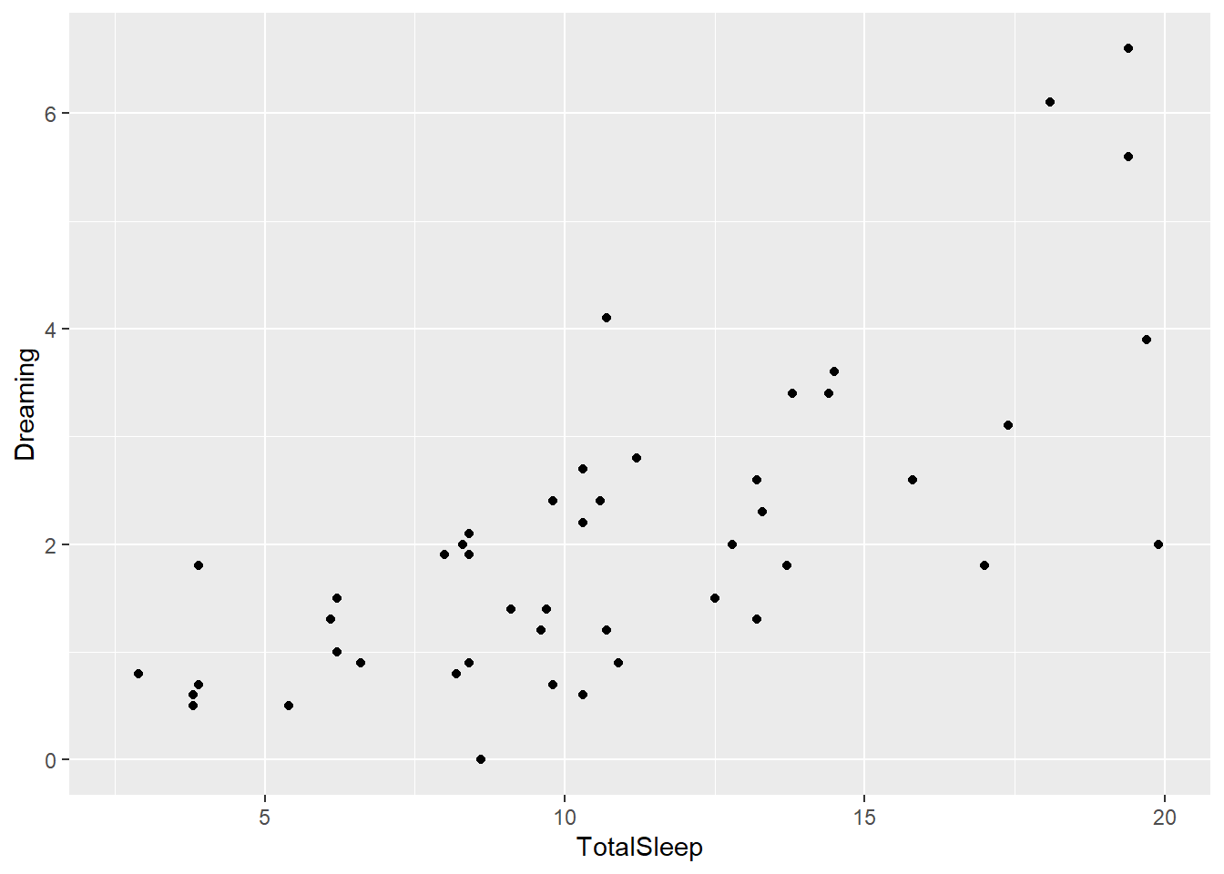
If nothing extra is given, the geom_commands inherit everything from the ggplot command. So here we get a scatter plot of the relationship between TotalSleep and Dreaming. Note the axis labels are the column titles, which may not be what we want in the end in regards to readability.
However, now you have a basic plot. You can also use other arguments in geom_layer commands to add to it. For example, let’s color these by primate
ggplot(sleep, aes(x=TotalSleep, y = Dreaming)) +
  geom_point(aes(colour=Primate))
Warning: Removed 14 rows containing missing values or values outside the scale range
(`geom_point()`).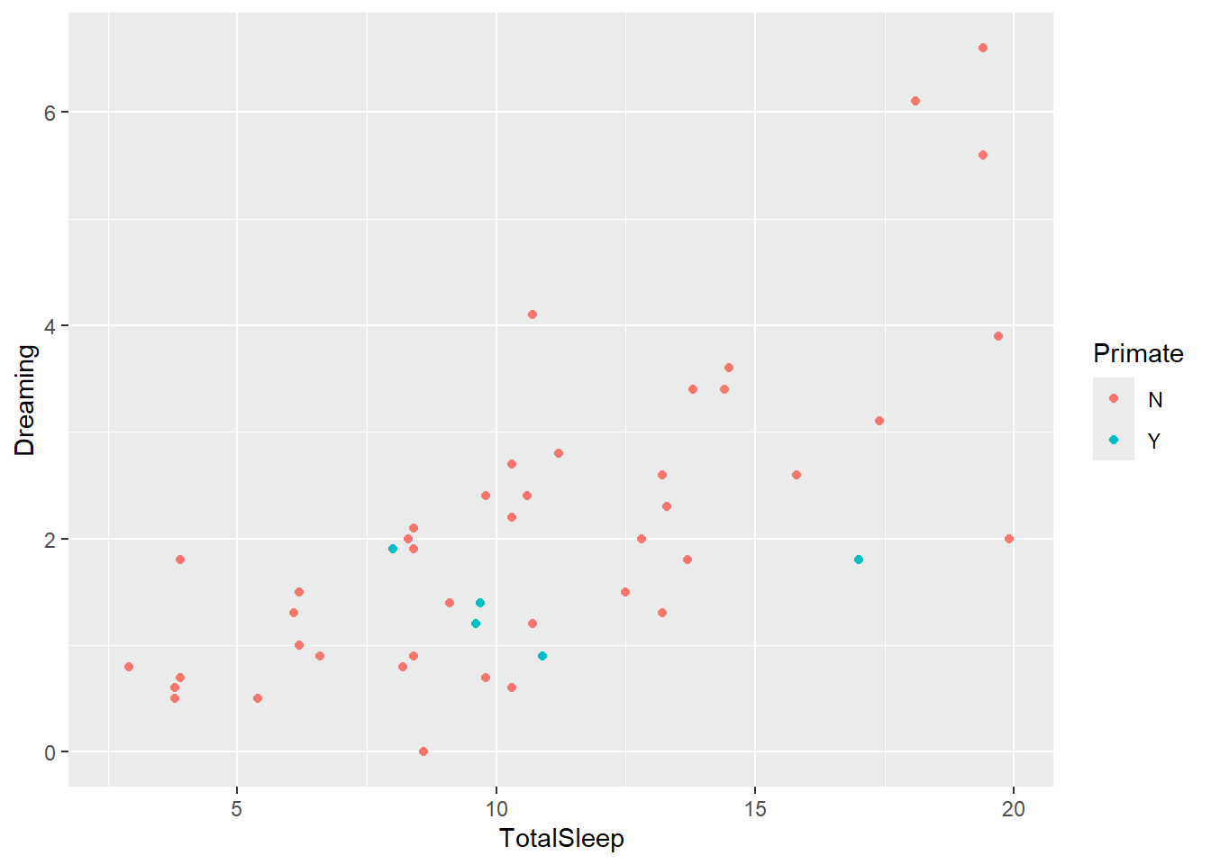
Now we’ve added information on primates. Since that require us to get more data from the dataset, we had to add another aes argument. Note this is different from this (which causes an error1)
ggplot(sleep, aes(x=TotalSleep, y = Dreaming)) +
  geom_point(colour="Primate")
Warning: Removed 14 rows containing missing values or values outside the scale range
(`geom_point()`).Error in `geom_point()`:
! Problem while converting geom to grob.
ℹ Error occurred in the 1st layer.
Caused by error:
! Unknown colour name: Primateand this
ggplot(sleep, aes(x=TotalSleep, y = Dreaming)) +
  geom_point(colour="blue")
Warning: Removed 14 rows containing missing values or values outside the scale range
(`geom_point()`).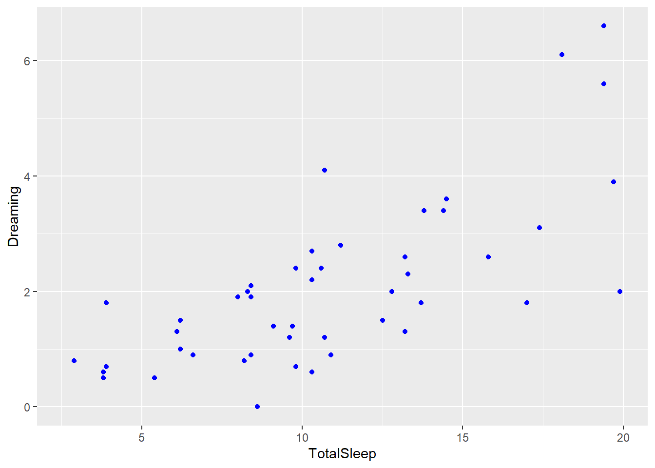
The first causes an error as primate isn’t a color. The second makes all points blue! Also note the 2nd method loses the legend as color now conveys no information.
In general, you have to put things you want to plot in the aes argument area and anything outside of that changes the entire plot. For example, we can change the size of all points using
ggplot(sleep, aes(x=TotalSleep, y = Dreaming)) +
  geom_point(size = 4)
Warning: Removed 14 rows containing missing values or values outside the scale range
(`geom_point()`).
This is also a good time to talk about renaming factor labels. You may want to change Primate levels to Yes and No for your graph. Lots of ways to do this, but the revalue function in the plyr package is nice (and we’ll use this suite of packages often, same person developed ggplot2, plyr, and reshape)
library(plyr)
sleep$Taxa <- revalue(sleep$Primate, c(Y = "Primate", N = "Non-primate"))
Notice what I did above. I made a new column from an existing one using a name I might want on a legend. Now I can use it in a graph.
ggplot(sleep, aes(x=TotalSleep, y = Dreaming)) +
  geom_point(aes(colour=Taxa))
Warning: Removed 14 rows containing missing values or values outside the scale range
(`geom_point()`).
I can also just change the legend title directly or change legend text, but often workign with the dataframe is easier for me.
If we wanted the levels of Primate in a different order, we can use the relevel function in the plyr package to set one as the “first” level (and then do this sequentially to get them in the right order if needed). You can also change level orders using the factor or ordered functions for multiple levels at once.
sleep$Taxa <- relevel(sleep$Taxa, "Primate" )
ggplot(sleep, aes(x=TotalSleep, y = Dreaming)) +
  geom_point(aes(colour=Taxa))
Warning: Removed 14 rows containing missing values or values outside the scale range
(`geom_point()`).
Finally, we can use the theme or related functions (like xlab, ylab, ggtitle) to change how the graph looks. Note, all the code here is verbose so you can change as needed, but you rarely need all this.
ggplot(sleep, aes(x=TotalSleep, y = Dreaming)) +
  geom_point(aes(colour=Taxa), size = 4) +
  #below here is ylabel, xlabel, and main title
  ylab("Average hours spent dreaming daily") +
  xlab("Average hours spent sleeping daily") +
  ggtitle("Time spent dreaming increases with total sleeping time") +
  #theme sets sizes, text, etc
  theme(axis.title.x = element_text(face="bold", size=28),
        axis.title.y = element_text(face="bold", size=28),
        axis.text.y  = element_text(size=20),
        axis.text.x  = element_text(size=20),
        legend.text =element_text(size=20),
        legend.title = element_text(size=20, face="bold"),
        plot.title = element_text(hjust = 0.5, face="bold", size=32),
        # change plot background, grid lines, etc (just examples so you can see)
        panel.background = element_rect(fill="white"),
        panel.grid.minor.y = element_line(size=3),
        panel.grid.major = element_line(colour = "black"),
        plot.background = element_rect(fill="gray"),
        legend.background = element_rect(fill="gray"))
Warning: The `size` argument of `element_line()` is deprecated as of ggplot2 3.4.0.
ℹ Please use the `linewidth` argument instead.Warning: Removed 14 rows containing missing values or values outside the scale range
(`geom_point()`).
A few options exist to simplify this. The labs function allows you to input all the labels (axes, title, etc) at one time, and preset theme options make a lot of decisions for you (that you can then update). The example below uses the theme_bw.For more, see https://ggplot2.tidyverse.org/reference/ggtheme.html. You can also save and name a theme so you don’t have to do all this everytime (if, for example, you want the same approach for a given article or presentation).
ggplot(sleep, aes(x=TotalSleep, y = Dreaming)) +
  geom_point(aes(colour=Taxa), size = 4) +
  labs(x="Average hours spent dreaming daily",
       y="Average hours spent sleeping daily",
       title = "Time spent dreaming increases with total sleeping time")+
  theme_bw()
Warning: Removed 14 rows containing missing values or values outside the scale range
(`geom_point()`).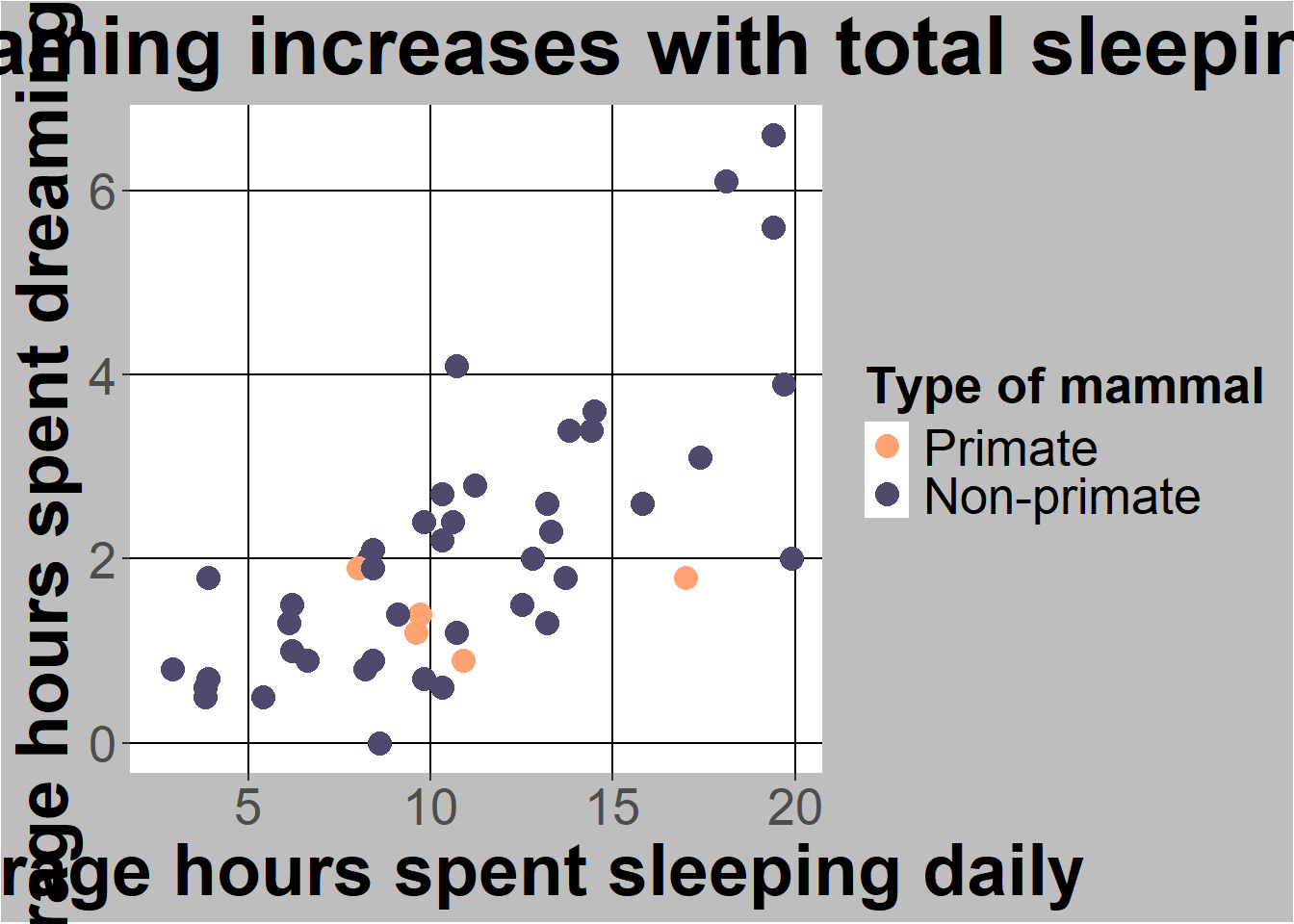
You can also directly change legend title and colours with the scale_ commands
ggplot(sleep, aes(x=TotalSleep, y = Dreaming)) +
   geom_point(aes(colour=Taxa), size = 4) +
  labs(x="Average hours spent dreaming daily",
       y="Average hours spent sleeping daily",
       title = "Time spent dreaming increases with total sleeping time")+
  scale_colour_manual(name="Type of mammal",values = c("#FFA373","#50486D"))
Warning: Removed 14 rows containing missing values or values outside the scale range
(`geom_point()`).
In general scale_[whatever you had aes commands]_manual lets you set colors or codes. To see color codes go to this chart
You can also facet a graph by another column. For example, I can split the graph I already made by Taxa
ggplot(sleep, aes(x=TotalSleep, y = Dreaming)) +
   geom_point(aes(colour=Taxa), size = 4) +
  labs(x="Average hours spent dreaming daily",
       y="Average hours spent sleeping daily",
       title = "Time spent dreaming increases with total sleeping time")+
  scale_colour_manual(name="Type of mammal",values = c("#FFA373","#50486D"))
Warning: Removed 14 rows containing missing values or values outside the scale range
(`geom_point()`).
facet_wrap(~Taxa, ncol = 1)<ggproto object: Class FacetWrap, Facet, gg>
compute_layout: function
draw_back: function
draw_front: function
draw_labels: function
draw_panels: function
finish_data: function
init_scales: function
map_data: function
params: list
setup_data: function
setup_params: function
shrink: TRUE
train_scales: function
vars: function
super: <ggproto object: Class FacetWrap, Facet, gg>Notice doing this and having legend may be redundant, so I can remove the legend
ggplot(sleep, aes(x=TotalSleep, y = Dreaming)) +
   geom_point(aes(colour=Taxa), size = 4) +
  labs(x="Average hours spent dreaming daily",
       y="Average hours spent sleeping daily",
       title = "Time spent dreaming increases with total sleeping time")+
  scale_colour_manual(name="Type of mammal",values = c("#FFA373","#50486D"))+
  facet_wrap(~Taxa, ncol = 1) +
  guides(colour=FALSE)
Warning: The `<scale>` argument of `guides()` cannot be `FALSE`. Use "none" instead as
of ggplot2 3.3.4.Warning: Removed 14 rows containing missing values or values outside the scale range
(`geom_point()`).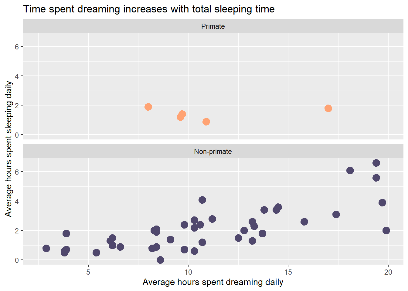
I also added a theme section to change the facet label. All this shows how you are focused on adding or layering levels in ggplot2.
You can save the most recent plot directly to your working directory using
ggsave("Fig1.jpg")Saving 7 x 5 in imageWarning: Removed 14 rows containing missing values or values outside the scale range
(`geom_point()`).This is useful when we need to send just an image to someone (or add it to a document). You can also just save using rstudio functionality.
ggplot2 is a great example of needing to undertand basic functionality without having to remember everything. The intro class lecture and accompanying code should help you get started. A few other points that often come up are noted below.
Histograms
For histograms, you only need one axis (frequency is calculated automatically)
ggplot(sleep, aes(x=Dreaming)) +
  geom_histogram()
`stat_bin()` using `bins = 30`. Pick better value with `binwidth`.Warning: Removed 12 rows containing non-finite outside the scale range
(`stat_bin()`).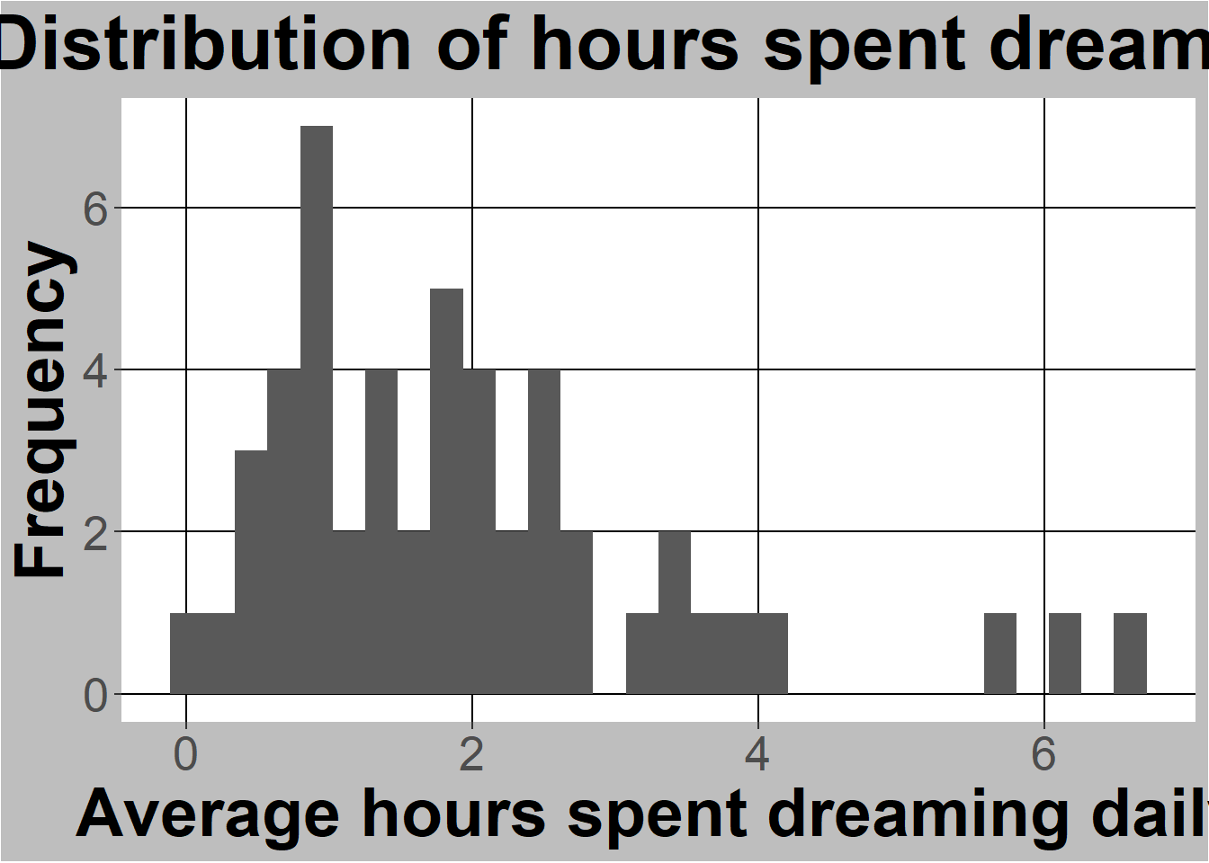
Note we can also add extra information like titles just like we did before.
ggplot(sleep, aes(x=Dreaming)) +
  geom_histogram() +
  labs( y="Frequency",
        x= "Average hours spent dreaming daily",
        title = "Distribution of hours spent dreaming")
`stat_bin()` using `bins = 30`. Pick better value with `binwidth`.Warning: Removed 12 rows containing non-finite outside the scale range
(`stat_bin()`).
Finally, remember you can subset the dataframes you feed to the ggplot functions (or any other function for that matter). For example, let’s just do a histogram of just primate sleep.
ggplot(sleep[sleep$Taxa == "Primate",], aes(x=Dreaming)) +
  geom_histogram() +
  labs( y="Frequency",
        x= "Average hours spent dreaming daily",
        title = "Distribution of hours spent dreaming")
`stat_bin()` using `bins = 30`. Pick better value with `binwidth`.Warning: Removed 2 rows containing non-finite outside the scale range
(`stat_bin()`).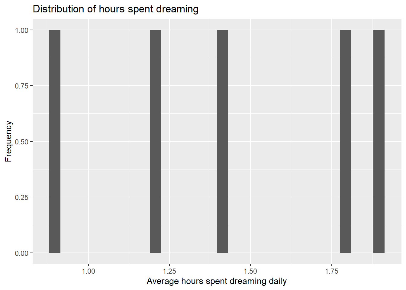
Not interesting, but you get the idea.
Barcharts and confidence intervals
Estimating is a key part of statistics and should include the value you are estimating and an estimate of uncertainty. Graphs typically show this using confidence intervals, which rely on samples of means following a normal distribution that we can describe. If we assume the estimate (not the data!) is normally distributed, we can assume things about uncertainty. Namely, we can build a 95% confidence interval around our estimate (meaning the true mean is in the range 95 out of 100 times we create a sample).
Now’s let do these in R. Confidence intervals are often tied to barcharts. Although these are common in practice, they are not easy by default in R as statisticians don’t love them. That’s because they use a lot of wasted color. I’ll show this in a moments. However, since they are common I’ll show you how to build them.
Let’s go back to the sleep dataset and consider the average total sleep time speed for each exposure level. First, lets change exposure to factors and label them
str(sleep) #just a reminder'data.frame': 62 obs. of 13 variables:
$ Species : Factor w/ 62 levels "Africanelephant",..: 1 2 3 4 5 6 7 8 9 10 ...
$ BodyWt : num 6654 1 3.38 0.92 2547 ...
$ BrainWt : num 5712 6.6 44.5 5.7 4603 ...
$ NonDreaming: num NA 6.3 NA NA 2.1 9.1 15.8 5.2 10.9 8.3 ...
$ Dreaming : num NA 2 NA NA 1.8 0.7 3.9 1 3.6 1.4 ...
$ TotalSleep : num 3.3 8.3 12.5 16.5 3.9 9.8 19.7 6.2 14.5 9.7 ...
$ LifeSpan : num 38.6 4.5 14 NA 69 27 19 30.4 28 50 ...
$ Gestation : num 645 42 60 25 624 180 35 392 63 230 ...
$ Predation : int 3 3 1 5 3 4 1 4 1 1 ...
$ Exposure : int 5 1 1 2 5 4 1 5 2 1 ...
$ Danger : int 3 3 1 3 4 4 1 4 1 1 ...
$ Primate : Factor w/ 2 levels "N","Y": 1 1 1 1 1 1 1 1 1 2 ...
$ Taxa : Factor w/ 2 levels "Primate","Non-primate": 2 2 2 2 2 2 2 2 2 1 ...sleep$Exposure <- factor(sleep$Exposure)Check levels
levels(sleep$Exposure)[1] "1" "2" "3" "4" "5"and relabel if you want (just for example here)
levels(sleep$Exposure)<- c("Least","Less", "Average", "More", "Most") Next, we need to get the average and standard deviation for each group (remember this is tied to the normal distribution!). If we wanted to this by hand, we could do something like thi (let’s just focus on least for an example, and note we have to remove NA data)
mean(sleep[sleep$Exposure == "Least", "TotalSleep"], na.rm = T)[1] 12.94615This is our estimate. The standard deviation of this estimate is
sd(sleep[sleep$Exposure == "Least", "TotalSleep"], na.rm = T) /
  sqrt(length(sleep[sleep$Exposure == "Least" & is.na(sleep$TotalSleep) == F, "TotalSleep"]))
[1] 0.7833111which is equivalent to
sd(sleep[sleep$Exposure == "Least", "TotalSleep"], na.rm = T) /
  sqrt(length(na.omit(sleep[sleep$Exposure == "Least", "TotalSleep"])))
[1] 0.7833111We also call this the standard error of the mean.
Fortunately, we can also do this using a function from the Rmisc package in R, as ggplot2 doesn’t have it built in (maybe because bar charts are a bad idea?).
library(Rmisc)
sleep_by_exposure <- summarySE(sleep, measurevar = "TotalSleep", groupvars = "Exposure", na.rm = T)
Inspect the table
sleep_by_exposure Exposure N TotalSleep sd se ci
1 Least 26 12.94615 3.994119 0.7833111 1.613259
2 Less 13 11.11538 3.957029 1.0974823 2.391209
3 Average 4 8.57500 1.808084 0.9040419 2.877065
4 More 5 10.72000 1.663430 0.7439086 2.065421
5 Most 10 4.19000 1.776670 0.5618323 1.270953Now we can use this summarized data to make a graph that shows uncertainty (95% confidence intervals)
ggplot(sleep_by_exposure
       , aes(x=Exposure, y=TotalSleep)) +
  geom_col(size = 3) +
  labs( y="Total sleep (hours per day)",
        title = "Sleep across different taxa")
Warning: Using `size` aesthetic for lines was deprecated in ggplot2 3.4.0.
ℹ Please use `linewidth` instead.
Now to show why barplots waste ink. Note we can show the same information with
ggplot(sleep_by_exposure
       , aes(x=Exposure, y=TotalSleep)) +
  geom_point(size = 3) +
  geom_errorbar(aes(ymin=TotalSleep-ci, ymax=TotalSleep+ci), size=1.5) +
  labs( y="Total sleep (hours per day)",
        title = "Sleep across different taxa")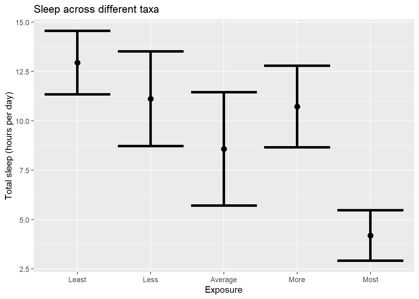
All the exta color is nice, but its not really adding anything! ## Let’s practice!
Let’s return to the mammal sleep dataset that we left off with last week (Make sure you did the first assignment!).
Load the dataset
sleep <- read.csv("https://raw.githubusercontent.com/jsgosnell/CUNY-BioStats/master/datasets/sleep.csv", stringsAsFactors = T)
#need to use stringsAsFactors to make characters read in as factors
Last time you used the built-in plot functions to do some plots. Let’s replace those with ggplot2 and do some more.
1
First plot how TotalSleep is explained by BrainWt (remember the issues with the data). Use ggplot2 to plot the relationship.
2
Next color code each plot point by whether or not its a primate. In order to do this you can use the Primate column or (following class code) make a new column called Taxa to represent the information (hint:search for “ revalue”). Make sure axes are well-labeled.
3
Let’s work with histograms.
- What type of variation do we see in total time spent sleeping? Create a histogram to explore this issue.
- Facet the graph you created based on whether or not the animal is a primate (Primate column).
- Now only graph the data for primates.
4
Develop a properly-labeled bar graph with error bars to explore how total sleep changes with
- Primate (relabeled as yes/no as Primate/Non-Primate; note there are multiple ways to do this!) – use a 95% confidence interval for the bar
- Predation risk (as a factor!) – use 1 standard error for the bar. Note the difference!
5
Find an example of a research article that is related to your research or a field of interest that includes a graph produced usnig ggplot2.(hint: use Google Scholar or another search engine to search for a keyword of interest plus ggplot2). Briefly answer the following questions
- What is the name of the paper and who are the authors?
- What is the main finding related to the graph?
- What was the dependent variable in the graph?
- What were the independent variables in the graph?
- Upload a picture of the graph here. To do so, take a screenshot of it, upload it to your repository, then insert the image. In visual mode, you can choose Insert > Figure/Image and select it. In source mode, you can update the file name below. Note the first portion is the alt text (in square brackets), and the file name is in the following parentheses. An exclamation point is at the beginning.
Estimates and Certainty Concepts
6
What does a 95% confidence interval mean?
7
To make sure you understand the ideas of sampling, confidence intervals, and the central limit theorem, review the visualizations produced by UBC:
- https://www.zoology.ubc.ca/~whitlock/Kingfisher/SamplingNormal.htm
- https://www.zoology.ubc.ca/~whitlock/Kingfisher/CIMean.htm
- https://www.zoology.ubc.ca/~whitlock/Kingfisher/CLT.htm
8
For this question you’ll need the central_limit_theorem.R script from the code_examples folder.
The call below find the file on the website and sources it. Source runs the entire code at once (similar to knitting an Rmd file or rendering a Qmd file) without showing any console output, but graphs and objects are still produced!
You can also source files directly in Rstudio. The Source button is next to the Run command we’ve been using for lines or segments.
library(VGAM)
source("https://raw.githubusercontent.com/jsgosnell/CUNY-BioStats/master/code_examples/central_limit_theorem.R")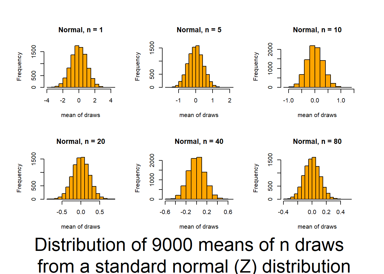
Press [enter] to continue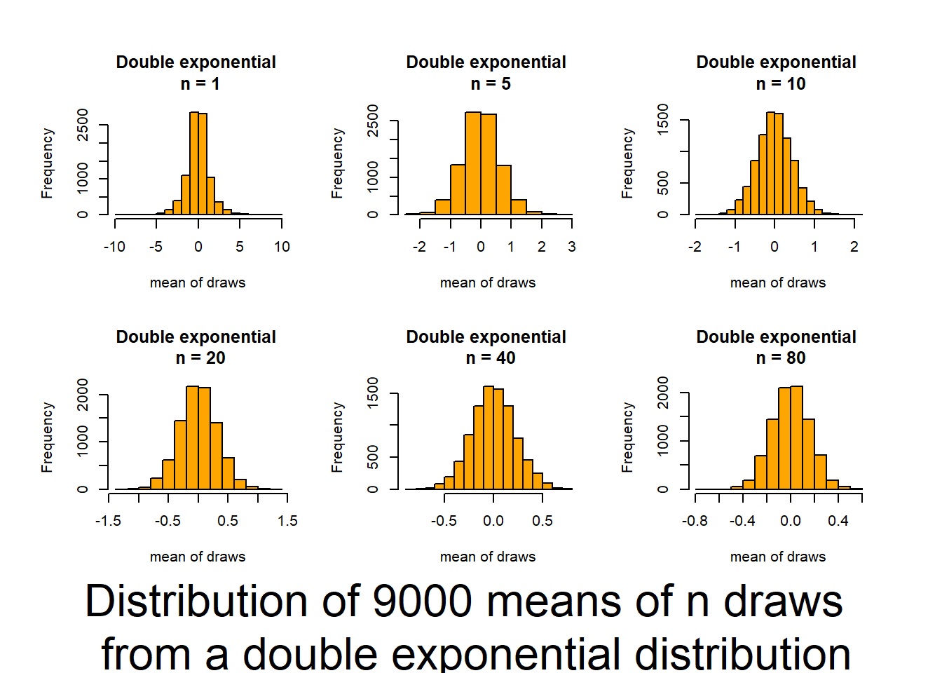
Press [enter] to continue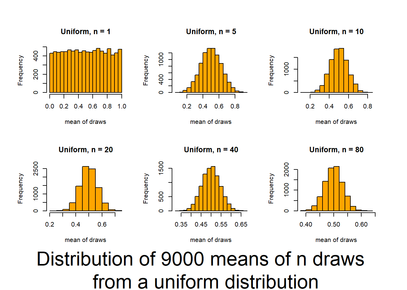
Press [enter] to continue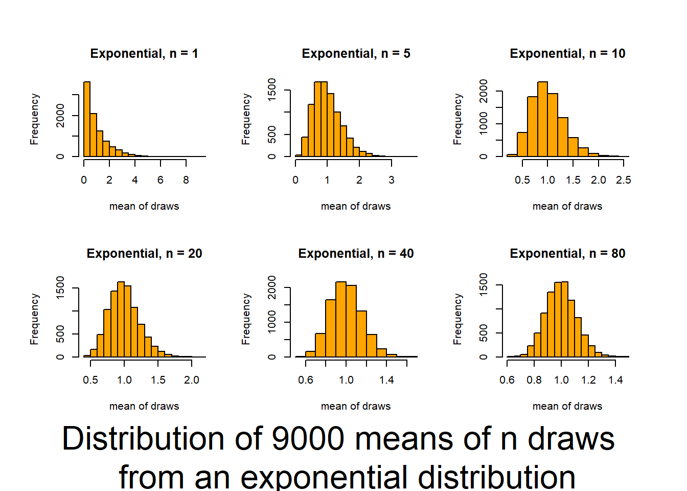
Press [enter] to continue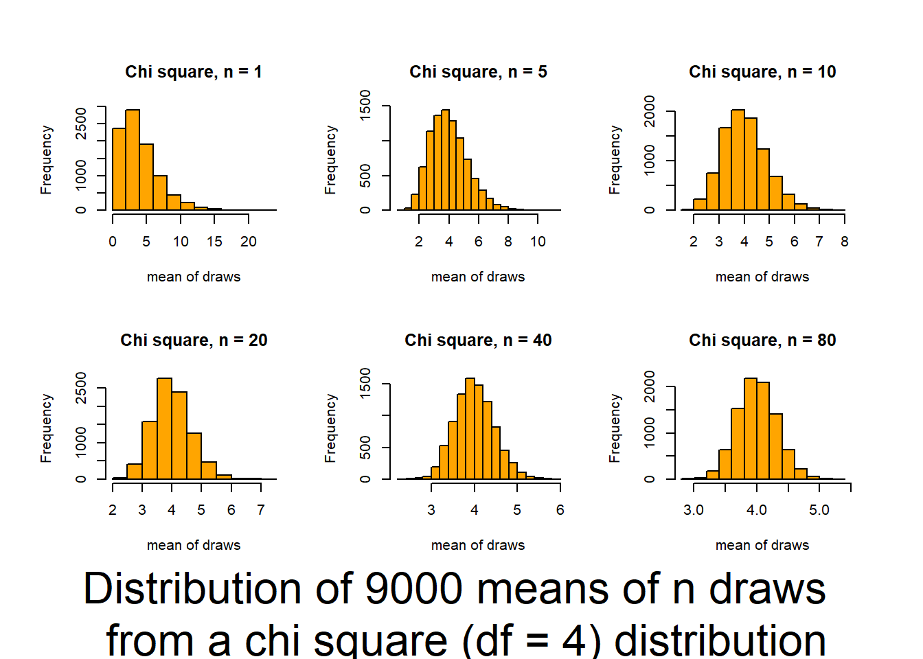
Press [enter] to continue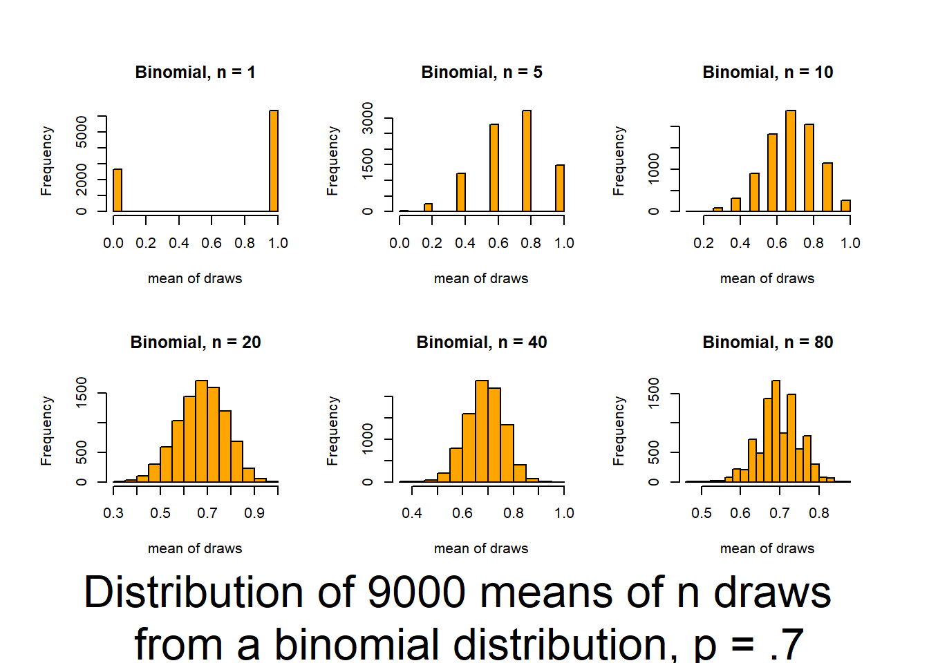
This script follows the UBC tutorial to show you how well the CLT (central limit theorem) works (and how it functions). This will be useful in coming to understand when you can trust tests based on the normality of means. The script produces output (graphs) that allow you to examine 6 distributions that differ in shape (skewness and kurtosis) and how those traits interact with sample size to influence the normality of means.
Source it (or look for the graphs produced in your html file) and and then review the plots and consider how sample size interacts with the shape of underlying distributions to influence how quickly sample means approach normality. The noted distributions are:
- Normal(Z) (0,1) {no Kurtosis / no skewness / no truncation}
- Double exponential (0,2) {high Kurtosis / no skewness / no truncation}
- Uniform(0,1) {moderate Kurtosis / no skewness / double truncation}
- Exponential(1,1) {high asymmetric Kurtosis / high skewness / single truncation}
- Chi-square(df=4) {low Kurtosis / moderate skewness / single truncation}
- Binomial distribution (p=.7) {discrete distribution]